
Navigating our brand evolution
Time for change
We felt it was time to evolve our brand to reflect our new vision and values, and as our website is essentially our 'shop window', we decided to give it a face lift at the same time.
Our previous branding served us well, but as we've grown the need for more adaptable and user-friendly assets became apparent. We have new considerations, such as our impact reports and the academy, and we needed a way to flex to accommodate these new activities and services.
A fresh approach
The decision to refresh our brand stemmed from a desire to rejuvenate our assets, making them more versatile and easier to work with. This wasn't about jumping on the latest design trends, it was about maintaining our unique identity while ensuring we remain relevant and recognisable.
We felt we needed more of an edge and a way to reflect that we're at the forefront of digital.
Our strategy was to simplify and modernise. We wanted our brand to reflect a timeless quality, focusing on strong typography and a more flexible colour palette. The website redesign served as a creative testing ground for these new elements, ensuring we maintained elegance and simplicity while taking a fresh approach.

A selection of website design concepts in Figma
Our website as a creative playground
Through the redesign of our website, we could explore and refine our brand's visual language. This process allowed us to move away from overly prescriptive elements and towards a more dynamic and adaptable identity. We could experiment with layout, subtle colour combinations, and typography to ensure our identity would shine through.
Prioritising accessibility
Accessibility was a key consideration, influencing our decisions around colour and design. We aimed to blend aesthetic appeal with practical accessibility, ensuring our digital presence is inclusive and welcoming to all users. This approach led to exploring various colour combinations and designs to meet accessibility standards.
Our front end team have been ruthless with testing against accessibility standards to highlight issues with the designs and where changes were needed.
We designed a dark and light mode and we decided to launch with dark mode as the default to highlight our commitment to sustainable design. Light mode will also be available in the near future.
Looking ahead
As we continue to evolve as a company, the brand is now flexible enough to develop with us, and it will be nice to see where the journey takes us next!
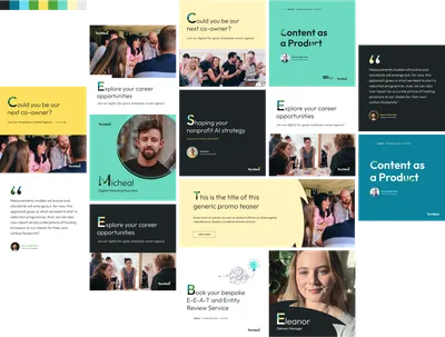
A collection of social media concepts in Figma
More
-

Legacy Fundraising: How Charities Can Build Relationships with Donors
Michael Wilkinson Product Director
- See more posts

