
Six Accessibility Lessons from the RNIB Site Build - By the Lead Front-End Dev
I was fortunate enough to have the opportunity to lead on the front-end for the RNIB’s (Royal National Institute of Blind People) new website last year. RNIB is the UK’s leading sight loss charity who raise awareness and campaign to make the UK more accessible for all. They offer support to blind and partially sighted people, as well as their families and carers. Not only that, but they also offer their own digital accessibility services in-house, so as a front-end developer with a particular interest in accessibility I really value their expertise and authority.

-
Identifying the challenges
As you might imagine, the project of leading on the front-end for such an accessibility-focussed new website felt pretty daunting! We needed to retain RNIB’s reputation as experts in accessibility while considering how we can push the boundaries to help position RNIB as a leading example in this area. What did we need to do to produce something that wasn’t just accessible, but also enjoyable to use?
User research is key
Sometimes accessibility can seem like a lot of checklists and technical problem solving but at its core it’s about people. This is the part I enjoy most - hearing from real users about the tangible impact of our work - and it’s this research that provides the most valuable feedback. It was this research that ultimately led us to help find some new solutions. The key was understanding RNIB’s users and the challenges they faced to deepen our awareness of how and why the existing site wasn’t meeting their needs.
After the successful launch of their new site last summer, I spent some time reflecting on our work with RNIB over the past year and collated some of the most valuable insights and lessons into the 6 points below.
1. Not all users are proficient at using the tools they rely on!
Okay this might sound really obvious, but in my naivety I had a preconceived notion that those who rely on screen readers (or any accessibility software) to browse websites probably have a pretty good idea of how to use them, or at least significantly better than me as they probably used them a lot, right? In reality there was a huge variety of experience and knowledge.
It’s easy to assume as a non-native user you’re never going to get a realistic testing experience, but it’s worth remembering that there are plenty of people trying to learn the ropes on their own and at varying levels of digital competency. So, if you’re struggling to do something while testing, chances are so are lots of others and it likely needs improvement!
2. Screen reader users could be using desktop software at mobile resolutions
Running tests with blind users was incredibly valuable to understand how they interacted with their computers. Often, the browser window appeared as a small square in the corner of the screen so only the top left hand corner of the site was visible. As a result, the user would be relying on their desktop screen reader software reading the site at very small mobile resolutions. This was something that just wouldn’t have crossed my mind without this testing.
Testing screen readers across all resolutions is especially important for users relying on keyboard navigation, as things like focus states could be easily overlooked on mobile.
3. People with disabilities can and do experience their disabilities differently on a daily basis
Somebody who has a visual impairment may experience their vision differently day-to-day, which also means their requirements could change daily too. On one day they may be able to get by with 200% browser zoom, while on others a screen reader might be essential. This will vary a lot depending on what options are available to them and the type of content they are viewing. If a website provides an option for dark mode and they find this makes it much easier to read, it might mean they can get away without using a screen reader at all - and if we consider the varying levels of experience mentioned above - this could be a gamechanger!
4. The GOV.UK Design System is a solid starting point for accessible patterns, but some refinements were needed
We started with a solid foundation for the new RNIB site using our GOV.UK Wagtail kit, which is based on thoroughly accessibility tested design patterns from the GOV.UK Design System. It proved to be a really helpful resource when it came to creating the core, reusable components on the site. However, while these patterns work for the majority of users, it’s important to remember they might not work perfectly for your users. It’s always worth running your own user tests to flag anything which might need further refinement for the audience you’re building for.
5. Accessibility doesn’t mean compromising on visual design
Just because something needs to be accessible doesn’t mean it has to be visually boring - the key is providing flexibility. If a gallery features lots of large imagery, consider adding an option to turn the images off so users can focus on the captions. If there are lots of bright, bold colours, add a theme switcher so users can choose an alternative colour scheme. Is a brand’s primary font proving difficult to read? Provide a well known, legible alternative. It may take a little more consideration initially, but like anything new, once it’s ingrained into your process it will become second nature - and your users will thank you!
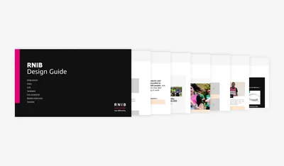
Our design guide for RNIB gave us a visually exciting yet accessible system to work with.
6. Accessible solutions are not a ‘one size fits all’
Context is really important when considering accessibility. While some guidelines are fairly black and white (e.g. does this copy have sufficient colour contrast?) others depend on the context of the site and the specific audience being targeted. Don’t assume that something implemented for one site may be the perfect solution for all others (though it’s always good having a solid starting point that’s been tested before!). It’s a good idea to get regular feedback to make sure a design is still serving its purpose.
Accessibility is a continuous work in progress and there is always room for improvement. WCAG guidelines and similar frameworks help us build a solid technical foundation, but it’s up to us how much further we go when it comes to shaping a more enjoyable and accessible experience for everyone.
I’m incredibly proud of our collaboration with RNIB and as we move into future phases of work together, I look forward to seeing the results and impact from future iterations.
If you’re interested in learning more about accessibility or feel you need some guidance identifying areas for improvement in your project, we can help! We offer a range of accessibility testing services which include automated & manual accessibility tests as well as usability or performance audits.
Remove barriers and improve performance with Accessibility testing.
Find out more

